

OverCome Health
When engineering led design goes wrong
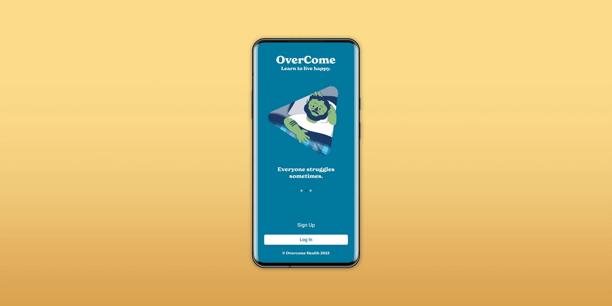
Overcome Health provides virtual mental health programs through articles, videos, and one-on-one chats with their trained coaches. They have been engineering-led for nearly a decade and it showed.
We worked together to reorganize their onboarding and product UX, redesign their UI, and create new animation, illustration, and copy for their platform.


Request From Client
We're a 12 year old mental health platform that sells both B2B and B2C. Our business partners said they're having trouble selling our platform into their organizations. Our B2C numbers are mostly non-existant. Can you make our home page look better?
Sure, what does your home page look like?

I see. Why does your home page look like that?
The home page is based on a piece of software that determines the next available achievement in a given person’s course program. The person’s course program is created based on a 60 question onboarding process and cannot be changed or altered by the person. The homepage design was created by our engineering team to express the product structure they also came up with.
Do your Users like that?

Oh no, not at all. Despite earning Amazon gift cards for completing programs (in other words, paying people to use the platform), only about four percent of people who sign up ever return to platform. The number of people who ever actually complete a program are significantly lower than that.
Whiiiiiiiiich is not because your home page is ugly.
After a ton of research and talks, the work we finally did with OverCome was:
- Rethink the product structure to give users agency while retaining the data and structure of extant features.
- Simplify onboarding without the requirement of feeding into this system.
- Redesign the home page to make it engaging, show progress, and add the ability for users to freely navigate content.
Rethink Product Structure
WEECO’s team spent a lot of time to working through the app ourselves. In our audit and subsequent work we partnered with OverCome’s product owners to get their experience and priorities. We were able to get access to and for a time take over OverCome's Help Desk to see what users were having problems with.
In talking with OverCome’s users, we found many of them didn’t even realize the programs created for them WERE customized. More terrifyingly, OverCome’s product designers didn’t seem to know the content was customized, either. This led us to our first major conclusion - the assumption that users appreciated or benefited from the kinds of customizations the platform was making from their convoluted sign up process was unfounded. Given that, the onerous onboarding process and associated tech debt wasn’t well spent and should be reworked.

Without going into specifics, the courses OverCome offered were not sequential. Each was an independent course on a mental health topic. People coming to the site were funneled into one course or another based on their onboarding questionnaire. If they had interests in something else, didn't take their onboarding questions seriously, their situation changed, etc, they were forced to complete the program they were assigned before they could do anything else. Alternately, they could take the 60 question onboarding questionnaire again and try to force a different outcome, but they'd be enrolled in both courses and the platform would choose which program they'd work on at in given time. If this sounds confusing, it's because it was.

Our proposal was to move from rigid paths that users were forced to complete to an open library model. All users would be enrolled in all courses. On first log in, they could choose a program they wanted to try out. On subsequent log in, they'd always return to the last program they interacted with. If they completed a program and didn't have any others they'd tried out, we'd prompt them to pick from a list of available programs. The underlying paths (Lesson 1, then lesson 2, then lesson 3) for any given program could still be used, salvaging a tremendous amount of configuration and providing a clear transition for existing users.
Simplifying Onboarding
Now that we had a more reasonable product structure, we could address how we go people to it. We took the onboarding process from 18 minutes to 45 seconds. We did it by removing the no-longer-needed 60 question onboarding survey. Onboarding would now be just a few splash screens and account creation.
Given the complexity/disorder of the platform to date, we knew that users were confused by everything it had to offer. We implemented into the onboarding a series of tool tips to familiarize people coming in with some of the features they had to offer. Once the structure was in place, we could trigger them based on a variety of milestones so we didn't have to frontload everything and overwhelm people.

Old Feature Repurposed
The questionnaires we removed from the onboarding process weren't going to be scrapped though. They were still really useful to people on the platform. As background, these questions are clinical surveys used by clinicians to diagnose common mental health disorders. Each is graded on it's own scale, so comparing between surveys is difficult. Further, some disorders are more serious than others, and are prioritized for treatment.
There were a lot of use cases for the site that didn't support the questionnaires acting as gatekeepers. Instead, we'd offer the questionnaires as a supplemental tool on the site so users could find out where they stood and measure progress over time. If a user took a questionnaire and tested within a certain range, the site could still make a suggestion, but it was no longer a hard requirement.

We created a UI for accessing and presenting the questionnaires that would allow users to see at a glance which they'd taken, compare questionnaires for different disorders, drill into various levels of information, and all be created with accessibility in mind (both an ethical consideration and a contractual obligation for OverCome).
Make the Home Page Look Better
So, now that those things were straightend out, we could work on the original request to make the home page look better!
OverCome's compensation was based in part on people engaging with program activities. One of the primary issues with the previous design was heirarchy. People were really supposed to interact with section highlighted in the image above, but it only took up six percent of the page. We'd need to emphasize the next activity more.


Another big problem with the existing design was that it was so boring that it essentially didn't show change. It looked the same before and after you'd completed something because it looked more like a form than it did a home page.
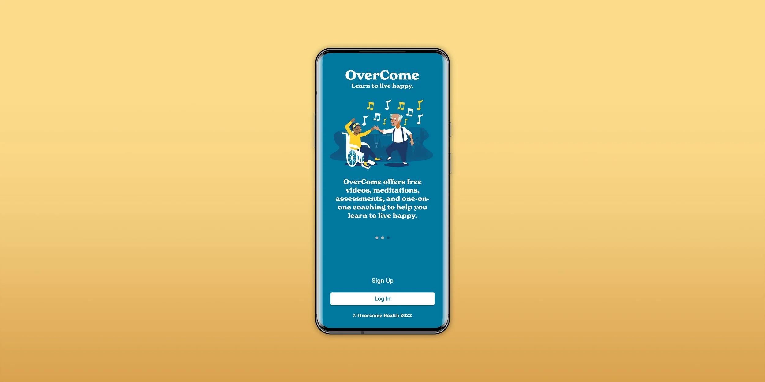
We needed people using the platform to feel like it was fresh whenever they came to the home page. We'd add imagery so people could see this was more than just a form and some care had been taken. We used illustration because 1.) you can control what it shows instead of hoping for the right stock image, 2.) it can be more softer and more approachable given the sensitive nature of mental health content, and 3.) because the platform already had made some attempts at illustration and wanted some continuity. The images on the site were a mix of stock photos and illustrations. The illustrations were in the Corporate Chic style used so widely, but executed very, very poorly. As a part of our work for OverCome, we replaced every illustration and stock photo on the site and added more where needed. In total, that represented several hundred illustrations.

In our redesign, the section we wanted people to engage with was enlarged to 35 percent of the total page. It included illustrations that changed every time a user completed an activity. That kept the homepage fresh and drew users to the CTA on the page. Our program switching drop down was in place and reused front end code from tool tips to allow people to interact with the content library they had available.
We also designed a dashboard so people could see their progress, the rewards they were earning and other notifications and features OverCome wanted. This dashboard could change easily and mold to a variety of uses OverCome might have for it.

Analysis
Its sort of cliched when creatives talk about solving problems that they weren't asked to solve. Its often equal parts salesmanship and self service. In this case, it was largely necessary to fix a logjam that led to the home page looking the way it did. The changes to the dramatically increased user retention and user engagement, which had direct impacts on OverCome's compensation. I can't speak to specifics about whether it helped people actually feel better or improve their mental health, but I like to think it did.