

The Caregiver Program for Overcome Health
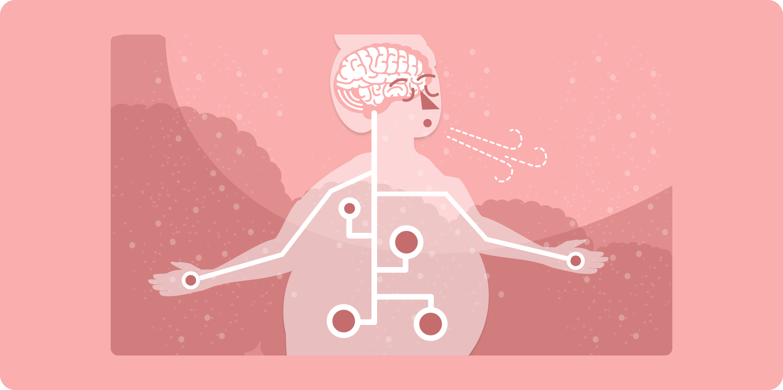
Nearly ⅓ of Americans serve as informal caregivers. They take care of an elderly parent, a disabled child, a spouse, or maybe a neighbor. It’s an incredibly difficult job that pays no money and often carries with it a huge toll on their time, energy, and mental health. As Boomers age and wealth distribution is what it is, the number of informal caregivers in the US is expected to grow. We have a real need to protect their mental health because we need them to be able to take care of huge portions of vulnerable people. We launched the Caregiver program to make our contribution.
This was an awesome opportunity because it was the first new product line OverCome had launched in several years. We were able to work with a really brilliant and experienced expert - Dawn Bazarko - to create a basic structure for the program. What we knew was it would be ten levels of content, including an intro level and a wrap up level. The content would be focused around a mindful approach to stress management. Each level needed to have some education content and some exercises so people could practice what they were learning.
For each level, we received an outline of the major points we needed to cover. The actual copywriting was up to us. One hitch - we weren’t experts. We kicked off hundreds hours of research. We asked ourselves, What was this program really about? How would it fit into people’s lives? How do we tell the story Dawn laid out? How do other people talk about this stuff, explain it, and structure their own lessons?
The population we were trying to reach was informal caregivers looking for help. They were generally time and resource starved, predominantly women, and a mix of ages, races, and ethnicities.

Telling a Story
In order to make the content approachable, we combined what we knew about our users, the platform, and our resources. We started each lesson with a narrative. The character made it easier to grasp content that can be sort of nebulous and hard to pinpoint. We were also able to show different personas through all of the different characters, which hopefully allowed people to see someone like them and someone in a similar situation who they wouldn’t have thought much about.
The voice of the program was casual and welcoming. At all times, we invited people to join us and try things out. We used casual language to help create a safe space for people to experiment with the concepts and practices we were offering. We used metaphors frequently and tied each lesson’s content back to the narrative, which allowed us to build connections between the tangible characters and the intangible concepts.
We spent far more time researching, writing, and rewriting copy than we did on the design, illustration, and animation in the rest of the product. Copy writing is an essential part of the user experience, but it relies on the same basic questions design does - what does a user need and when?
Using Color
As we approached the design, we needed some structure. Every level had the same basic set of exercises - a review from the previous level, a new lesson, a writing exercise, a meditation, and a quiz at the end. That gave us consistency between the levels, but could also become confusing or repetitive. We wanted people to understand that there was some progression and novelty between the content in each level, even if the structure was the same. We used consistent graphics to introduce each exercise, but used different color schemes for each level. Every graphic added something to show that progression. For instance, the meditation graphic added candles corresponding to the level the user was in.
We extended the color scheme for each level into the lesson illustrations to create continuity in each level and give us some creative parameters to work in.


Illustration
All in all, it took about 230 illustrations to bring the program to life. That’s a lot, but no one is going to deal with text-only lessons and we didn’t have the budget to create full video lessons. Illustrations let us break up content, add color (literal and metaphorical) and express ideas silently.


Meditation Videos
Each lesson also included a meditation practice. We had audio files, but for a variety of reasons, didn’t want to make them downloadable. In testing, we found that a static page with an audio player on it wasn’t giving us the results we wanted, so we opted to create videos for each meditation.

There was no time budgeted for making those videos, so we had to get creative. Truthfully, we didn’t want people to watch the videos. Ideally, they’d have their eyes closed while they followed along with the meditation. The videos were really placeholders for before/after the meditations, for people who didn’t want to close their eyes (or peeked during the meditation), and to demonstrate the value we’d put on the program. Since people weren’t supposed to be watching the videos, we didn’t have to sync much of the animation and audio - really just small parts at the beginning and the end. That freed us up substantially.
We used domestic scenes - laundry, morning coffee, or the backyard so our audience - time starved people - would recognize that these meditations were practices they could work into the quiet moments in their day and didn’t require a total overhaul of their lifestyles.

Because we didn’t need tight syncing, the animations were made mostly of looping segments, which allowed us to set up animated concepts that could be extended to fit whatever length we wanted. We layered in consistent titles, looping background music, start and stop bells, and very light sound effects to help bring each video together.

Accessibility
Lastly - we made accessibility an organizational priority. Audio and Video presents challenges for the deaf and blind, but also for people with cognitive disabilities, low bandwidth, time limitations, and people who simply don’t prefer videos. To make sure they had access to the same content, we made the scripts from every meditation available underneath the video player. Accessibility tools generally use text as their basic component, so anyone preferring close captions, braille support, more time to follow along, etc can use the script to meet their needs. It also set a design pattern and created reusable components for future features.