Exceed Designs Co.
They didn’t invent the utility knife, They perfected it.
Exceed Designs offers a variety of tools, but is best known for producing the most refined utility knife ever made. We’ve had one in our pockets every day for years. When TSA took one (even though it had no blade in it), we bought another one before our flight even started boarding. When Exceed reached out looking for help with their branding, we jumped at the chance.
Wordmark

What’s not working
We started out by looking at Exceed’s current wordmark. What we saw was:
The hierarchy of Exceed’s original logo was backwards. “Exceed” is a more powerful, distinct, and action oriented word. “Designs” is fairly generic, and it shouldn’t be the larger word - consumers won’t remember it the way they will “Exceed”.
The letterforms are fine, but generic. They look like they’re trying to be from the future. They’re a widely available free font.
This design doesn’t mesh with their logo mark (more on that mark next).
The very smaller lettering and small breaks in the letterforms are challenging to reproduce at small sizes. They are already creating problems in small applications (on the knife itself, on social media icons, embroidery, etc).
Our thought

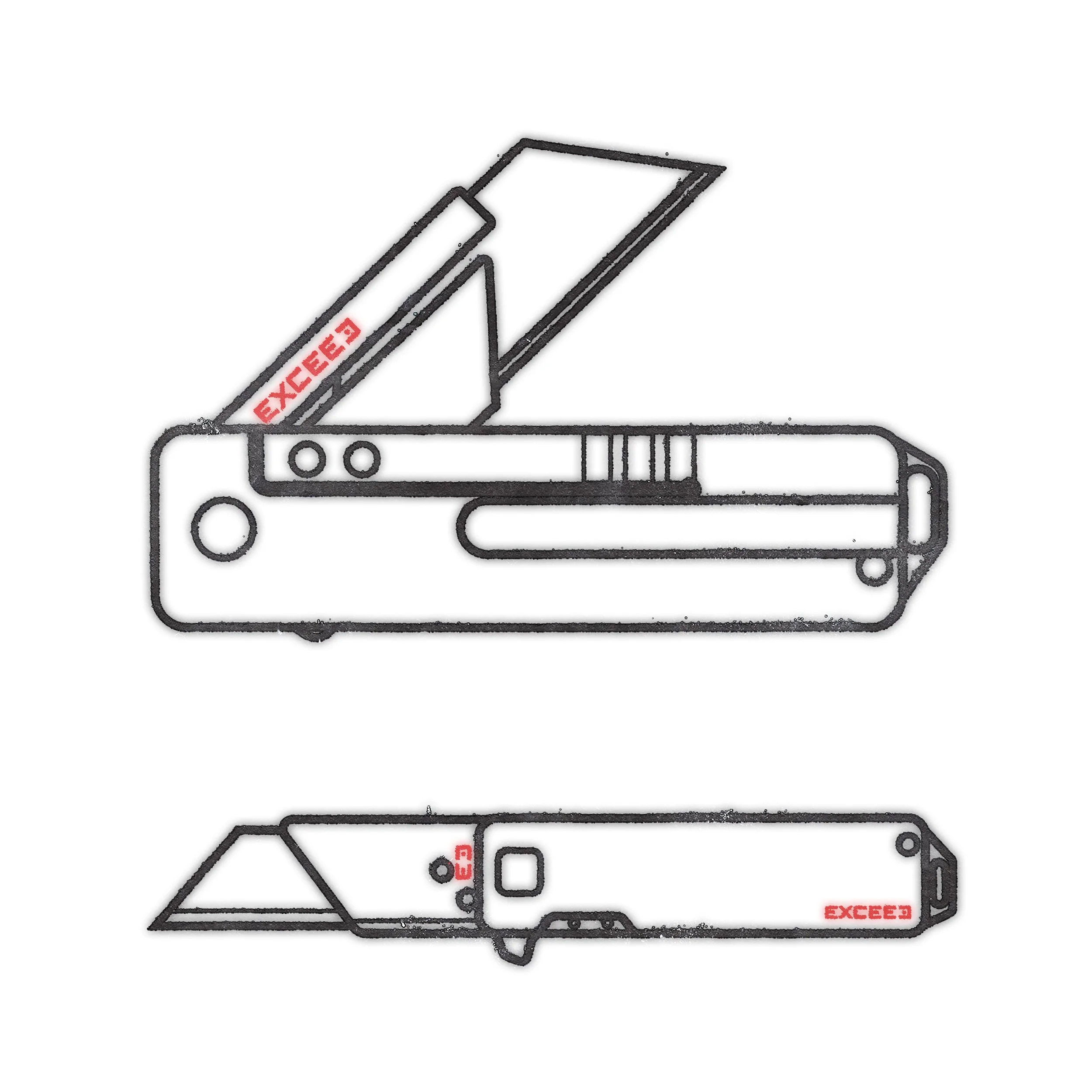
For our redesign we made the overall shape rectilinear to reference the shape of the knife.
We made custom letterforms so the word “Exceed” matches the proportions of the knife when it’s open.
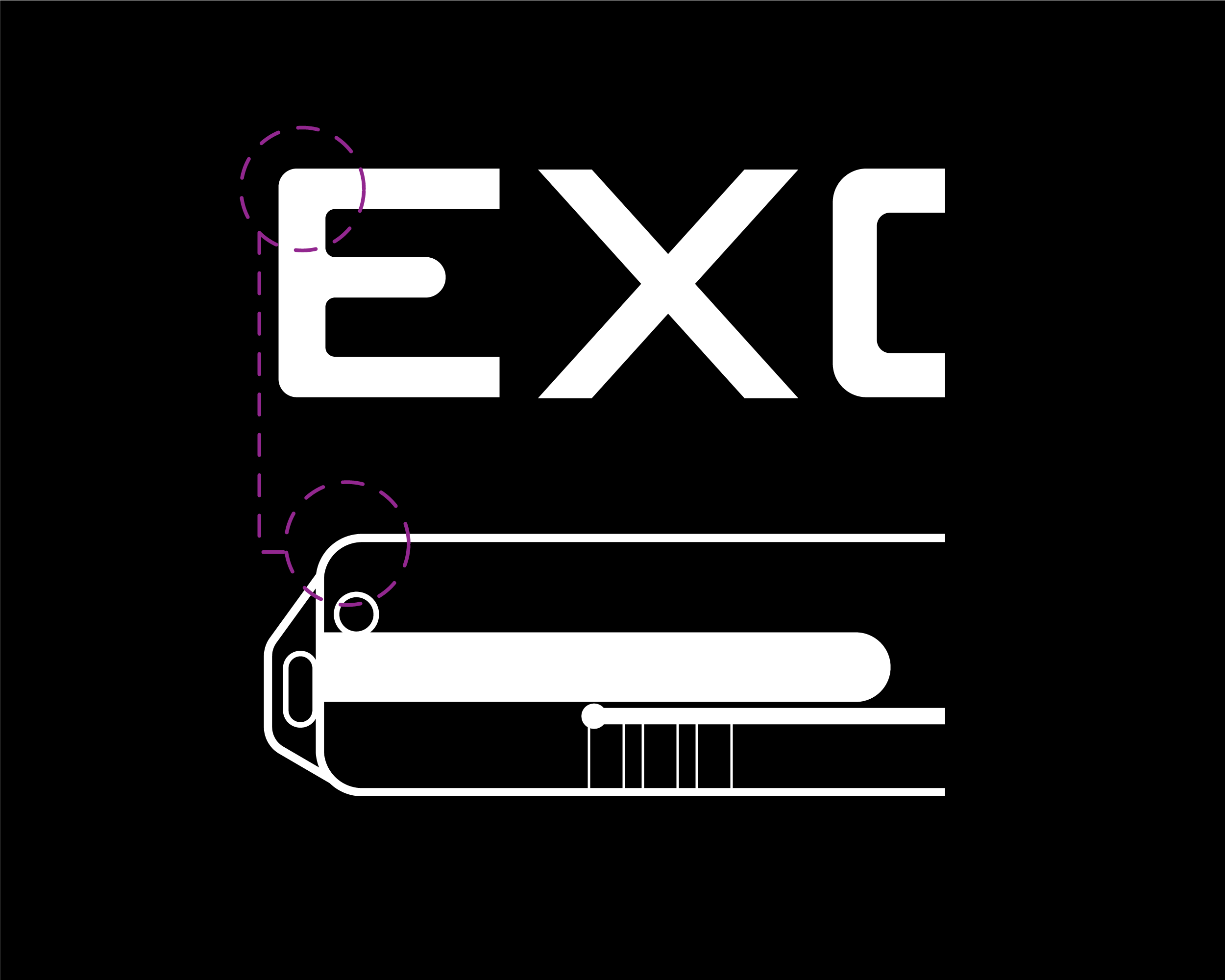
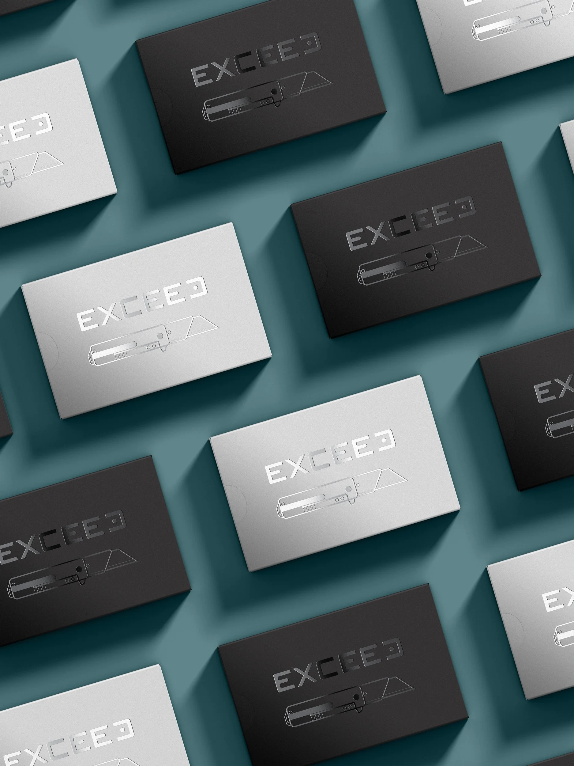
We borrowed the radiused corners from the knife to draw a connection between the letterforms and the product. This will also create a natural compositional aide when combining the wordmark with images of the knife and onto the knife itself.
Our lettering reuses shapes in a modular way as a nod to Exceed’s modular parts system (scales, clips, and back spacers that can be swapped to customize your knife).
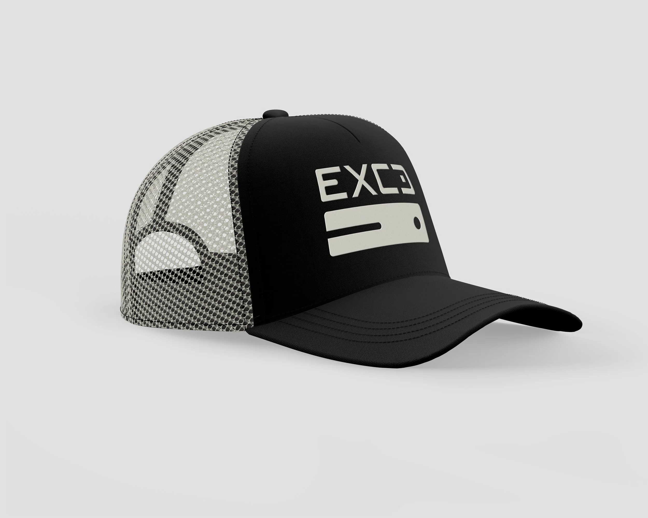
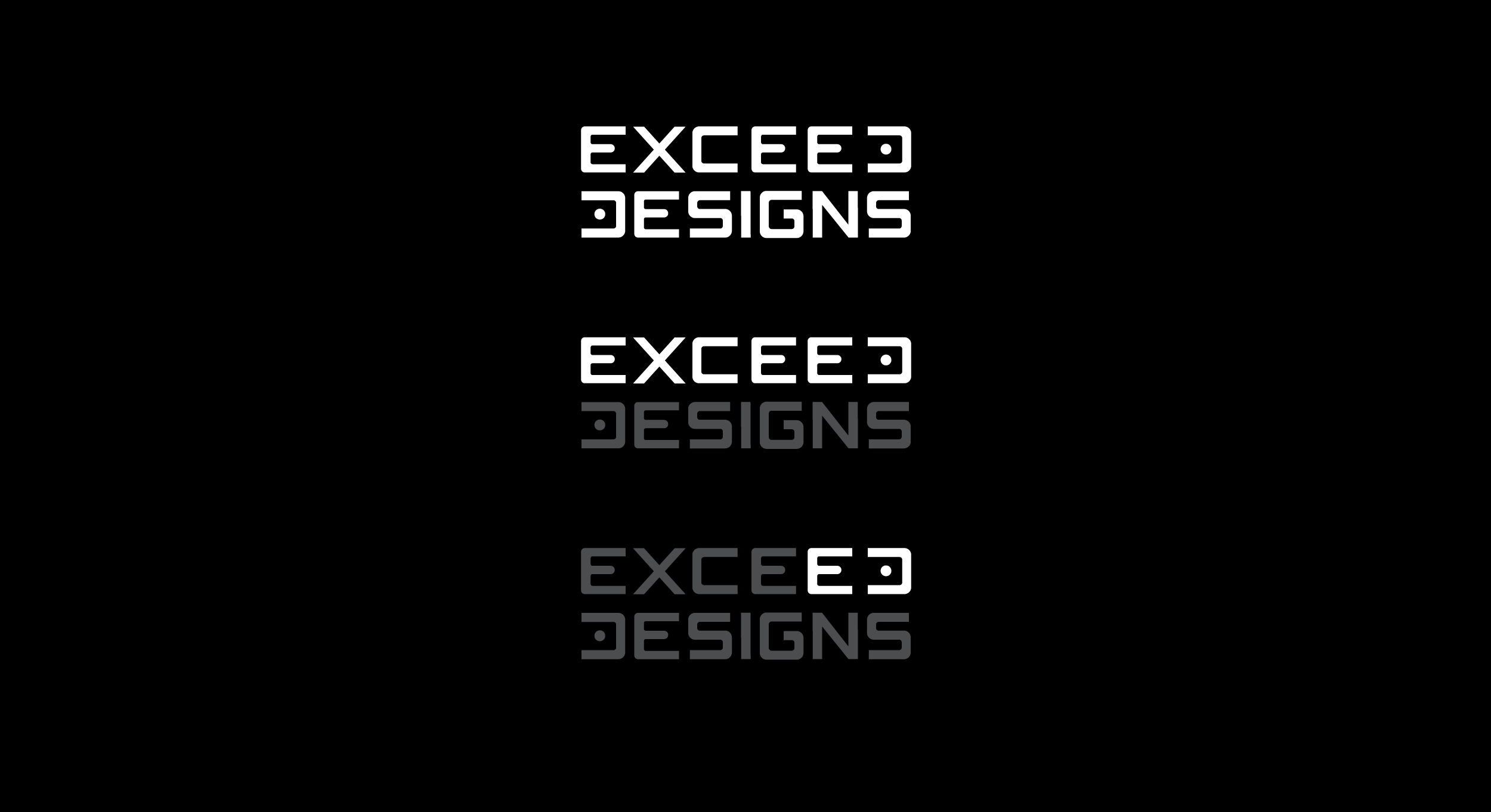
“Exceed” can be used in conjunction with or separately from “Designs”, creating the versatility in our logo system.
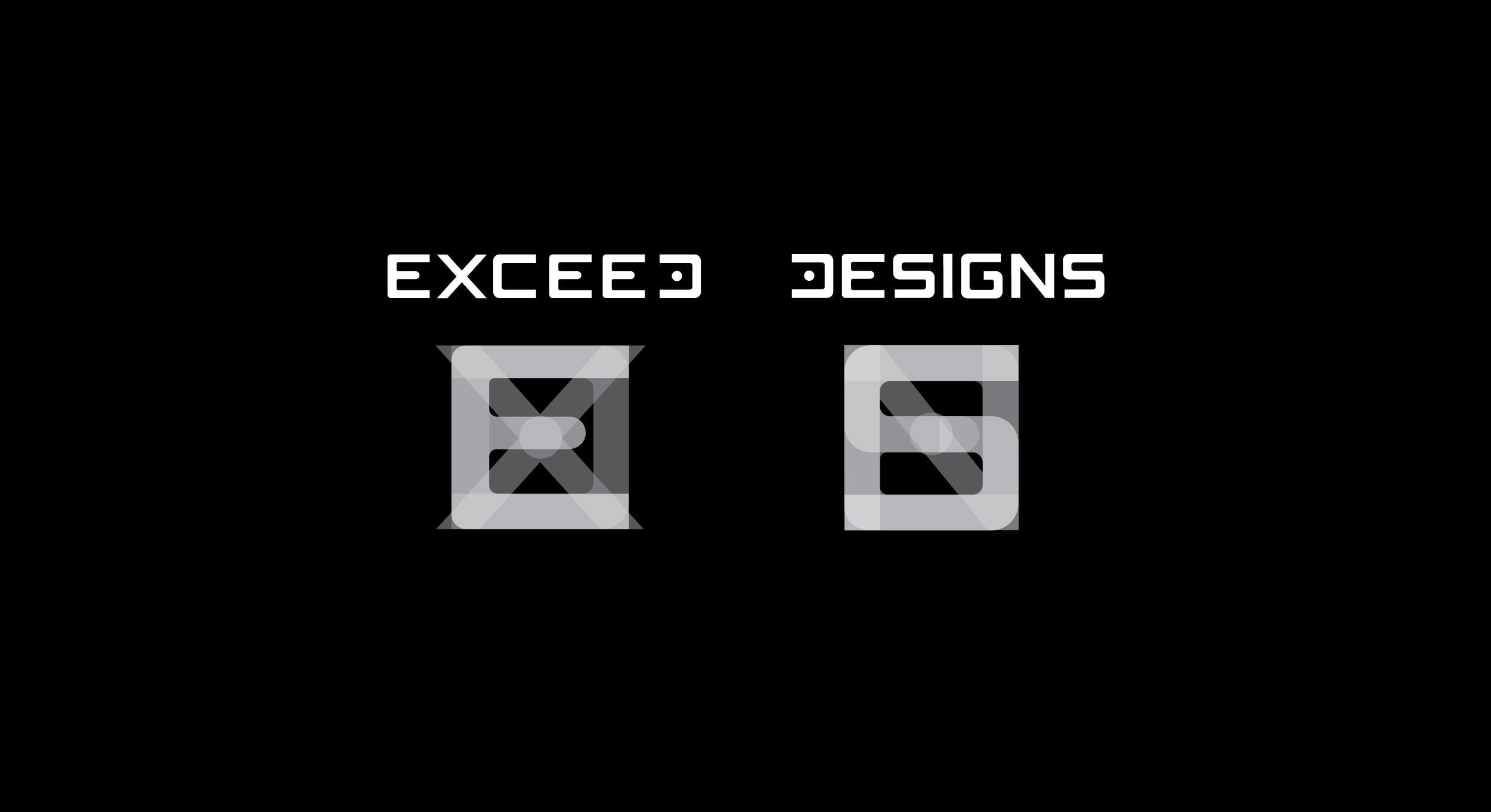
Logo


What’s Not Working
Exceed’s logo is a widely available stock logo, which is beneath their brand.
The slash makes some conceptual sense, but that visual language isn’t included in the wordmark or elsewhere in the brand or products. The small marks create the same issues for small reproduction we saw in the wordmark.
The extensions above and below the letter also make text alignment tricky.
Our Thought
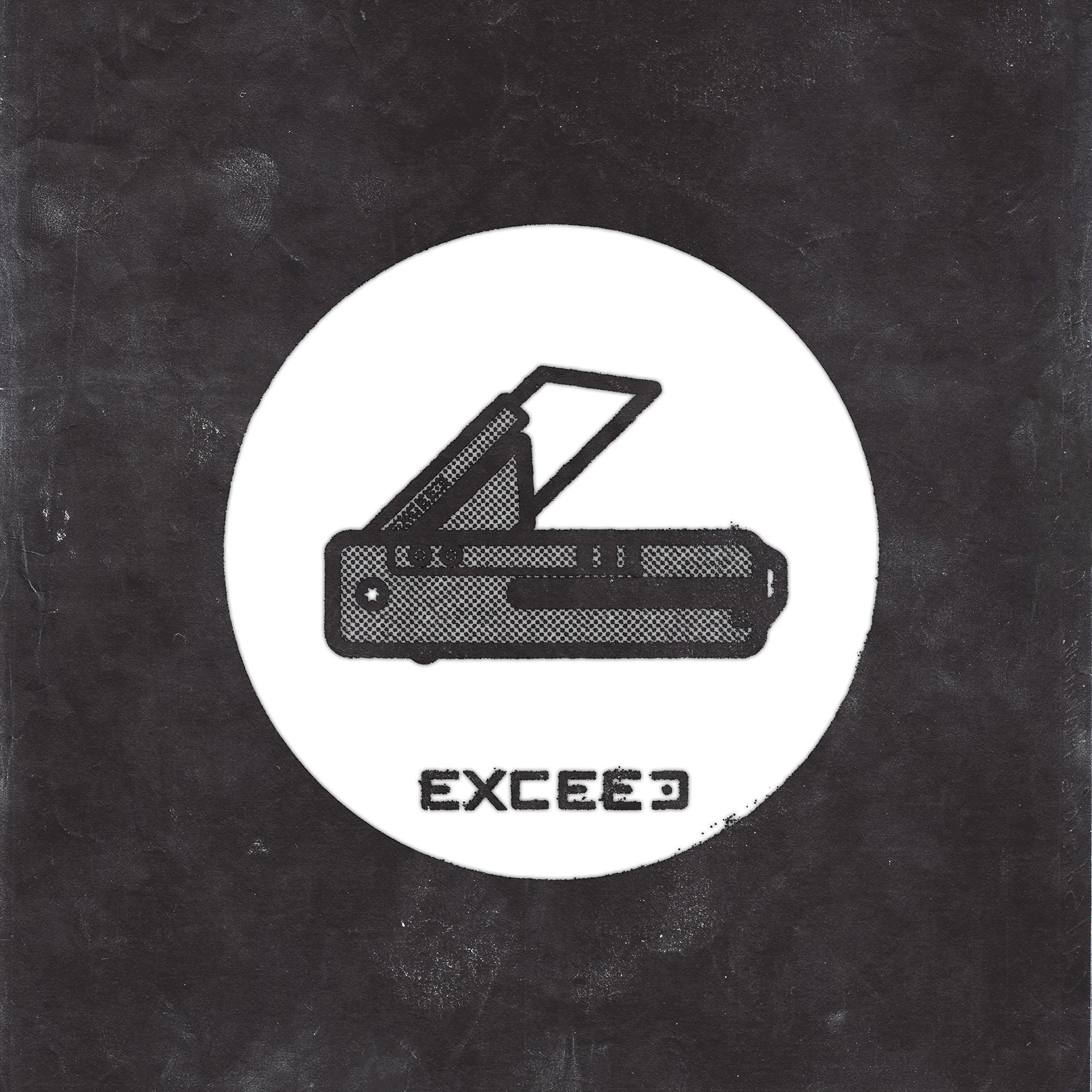
We built the wordmark and the logo in conjunction. We used the E and D to represent Exceed Designs instead of just using the E. Our logo mark reuses the letterforms from the ED that ends “Exceed” in the wordmark.

The negative space inside the E and D are proportional to Exceed’s knife when it’s closed.
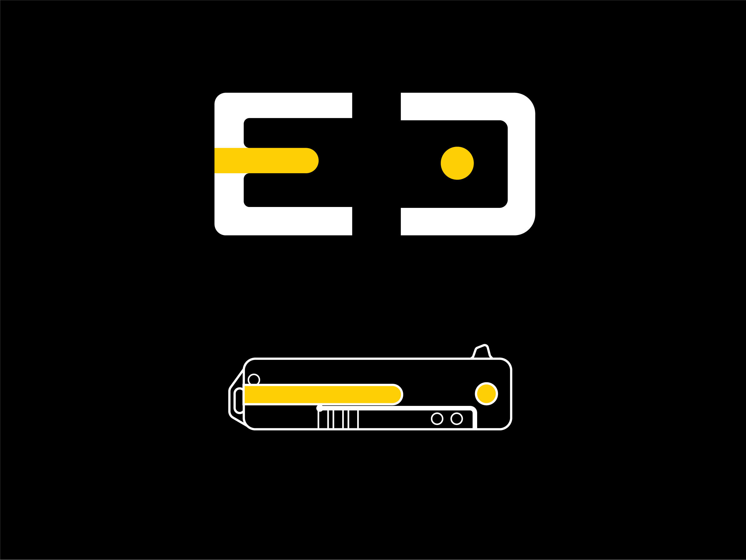
The crossbar of the E represents the knife’s pocket clip. The tittle in the middle of the D differentiates it from other letterforms and represents the pivot pin of the knife.
Since we reused letterforms, the logo is an integral part of the wordmark. They can be used separately, but the negative space illusion is always utilized. The repetition of the logo as a part of the wordmark helps build brand recognition.
Both of these marks use bold lines that will reproduce well at all practical sizes and in any media. The ability to split “Exceed” from “Designs” gives options based on size and space. The ED logo mark can fit in even smaller spaces and remain legible.
In the interest of completion, we included a tertiary mark for that shortens “Exceed” to “EXCD”. Without the E included, we lose the crossbar and thus the pocket clip. That’s an opportunity though - the opposite side of the knife includes a very distinctive square headed pivot bolt. This mark allows us to show both sides of the knife and create an additional mark for a variety of uses.
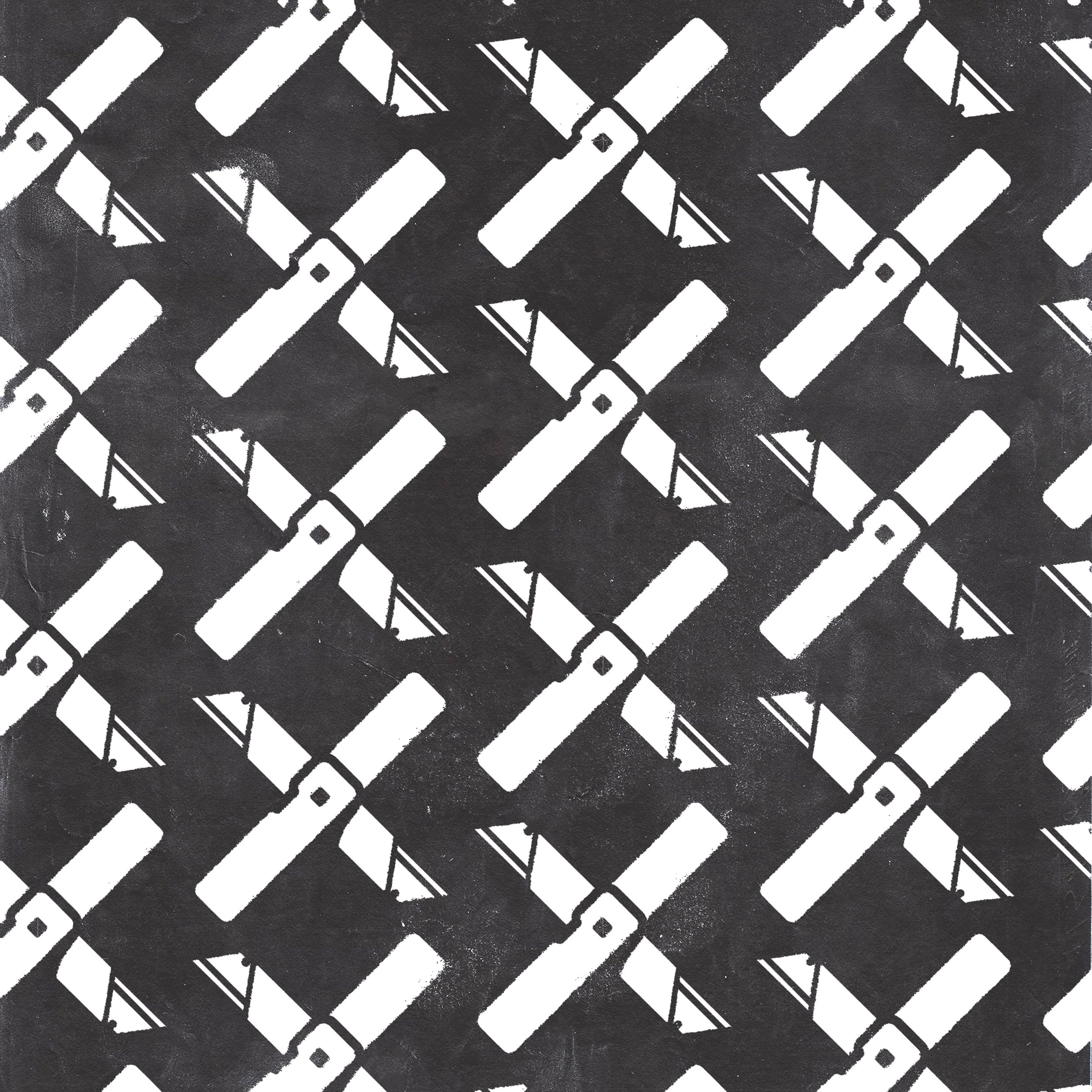
Support Graphics
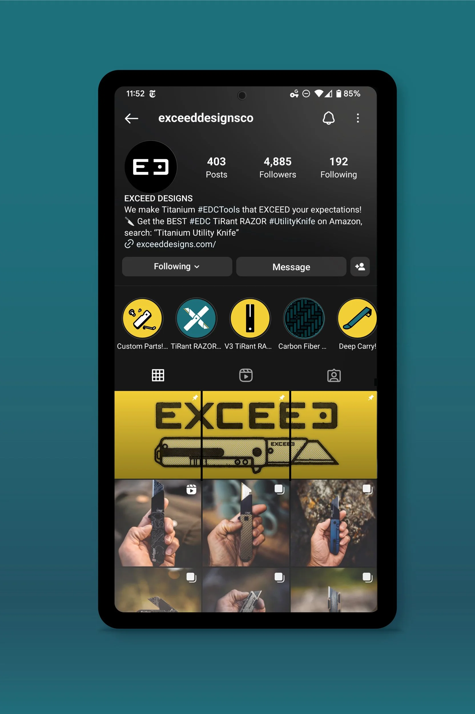
We made a variety of support graphics and patterns for Exceed to use in social media, stickers, packaging, and more.